CASA PACO
Casa Paco Aldeia is a Spanish Cuisine Restaurant located in Barueri, a city in the metropolitan area of São Paulo.
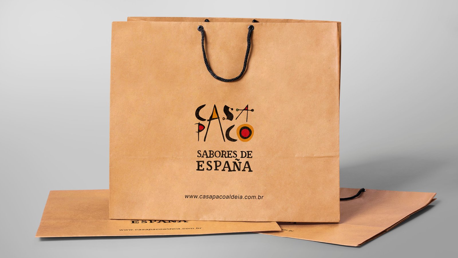
The restaurant is a second location to a business built in another city, Vinhedo, which means they already had a logo and a business model. Nevertheless, I was given the opportunity to enhance certain features and create a more sophisticated approach to the design and presentation of the brand.
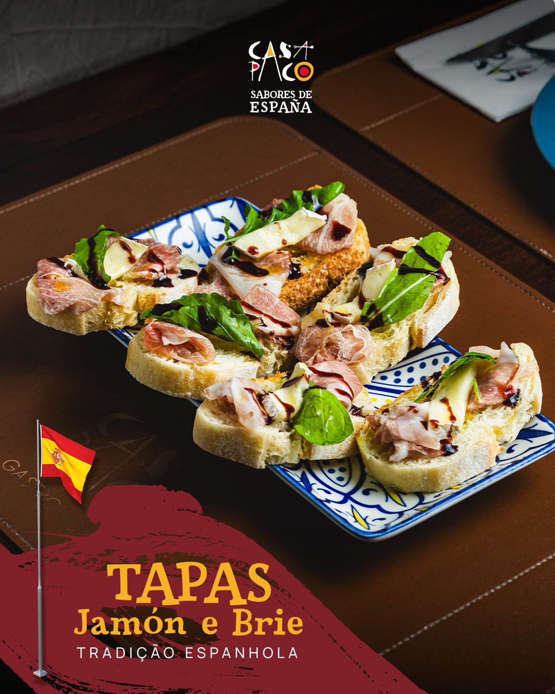
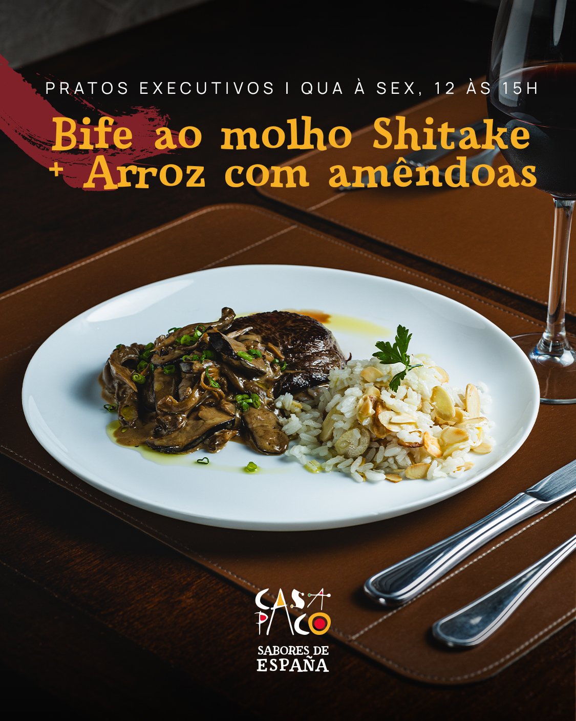
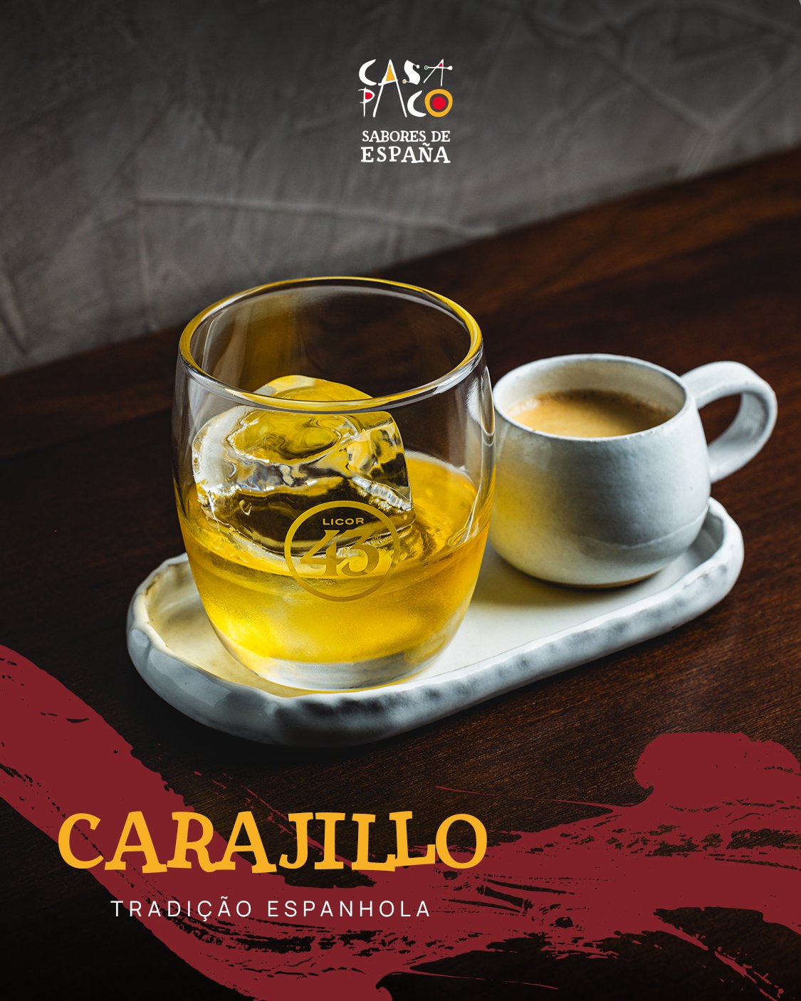
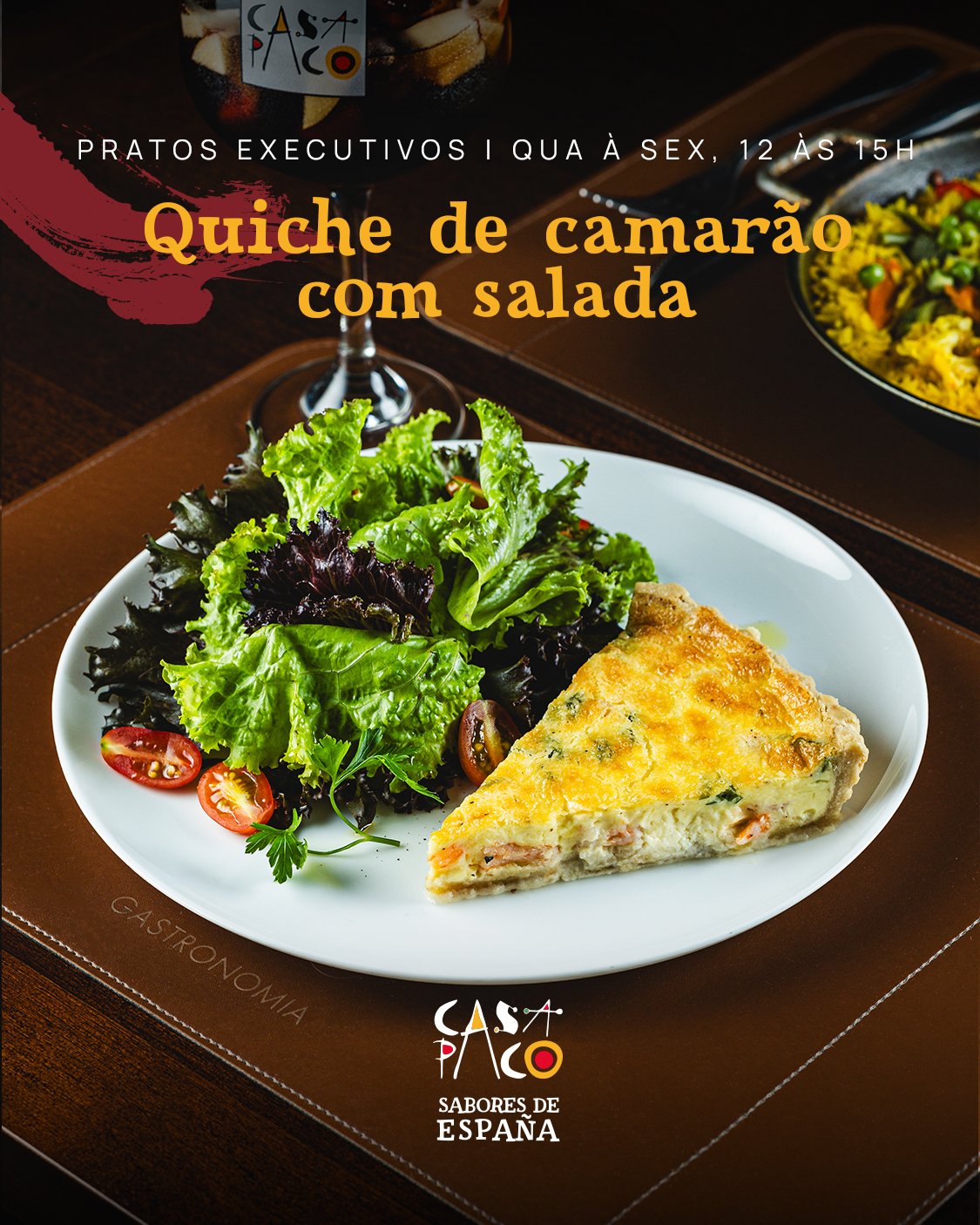
The initial logo was available, yet there were no established brand guidelines. Casa Paco’s first establishment embraced a lighter brand identity. My strategy involved deliberately introducing a contrast between the two restaurants. Although they share a partnership, the only fixed elements are the logo and the Paella recipe.
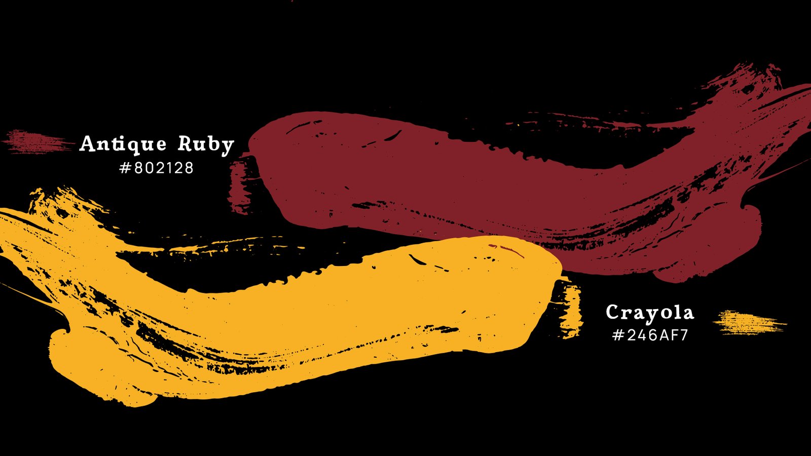
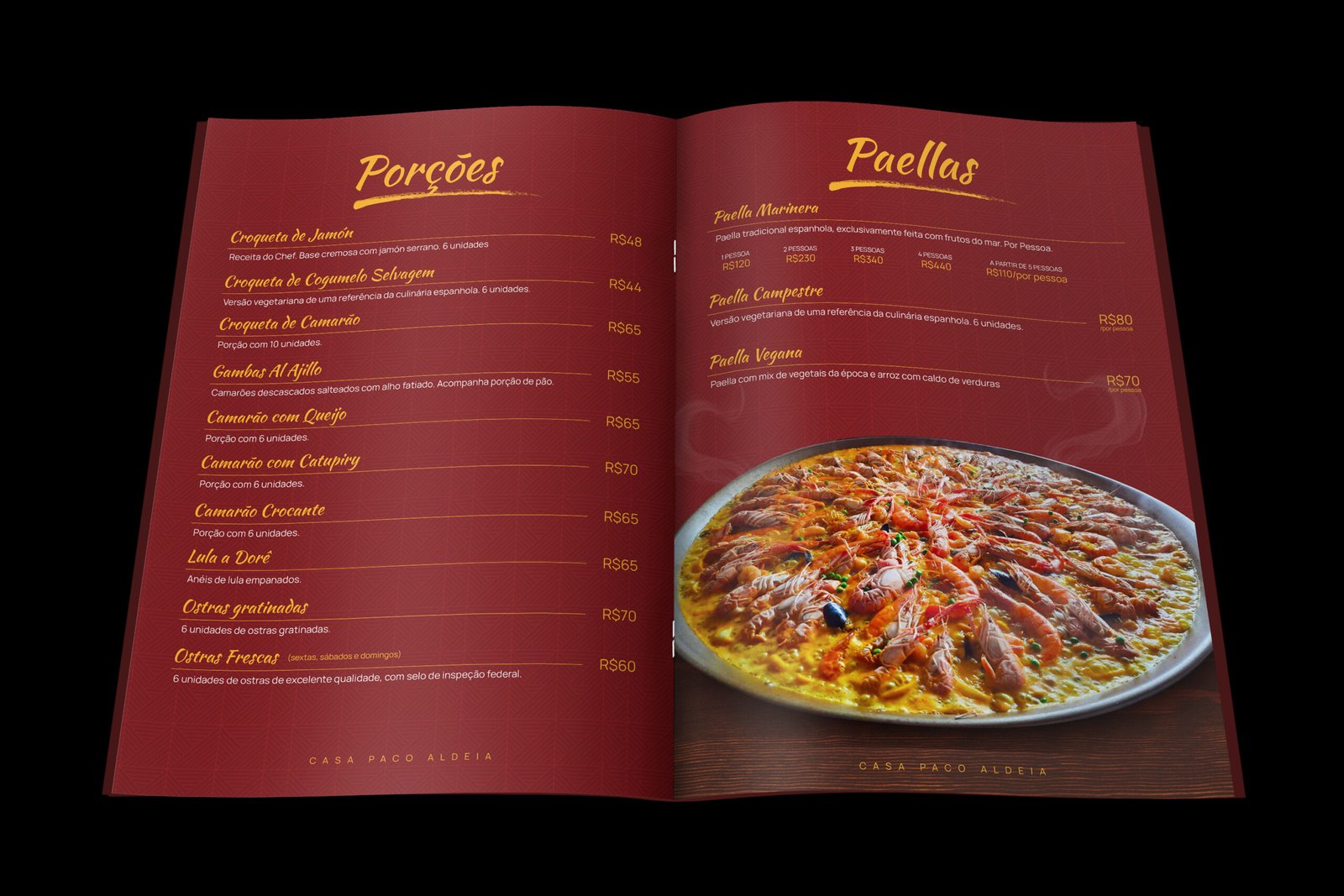
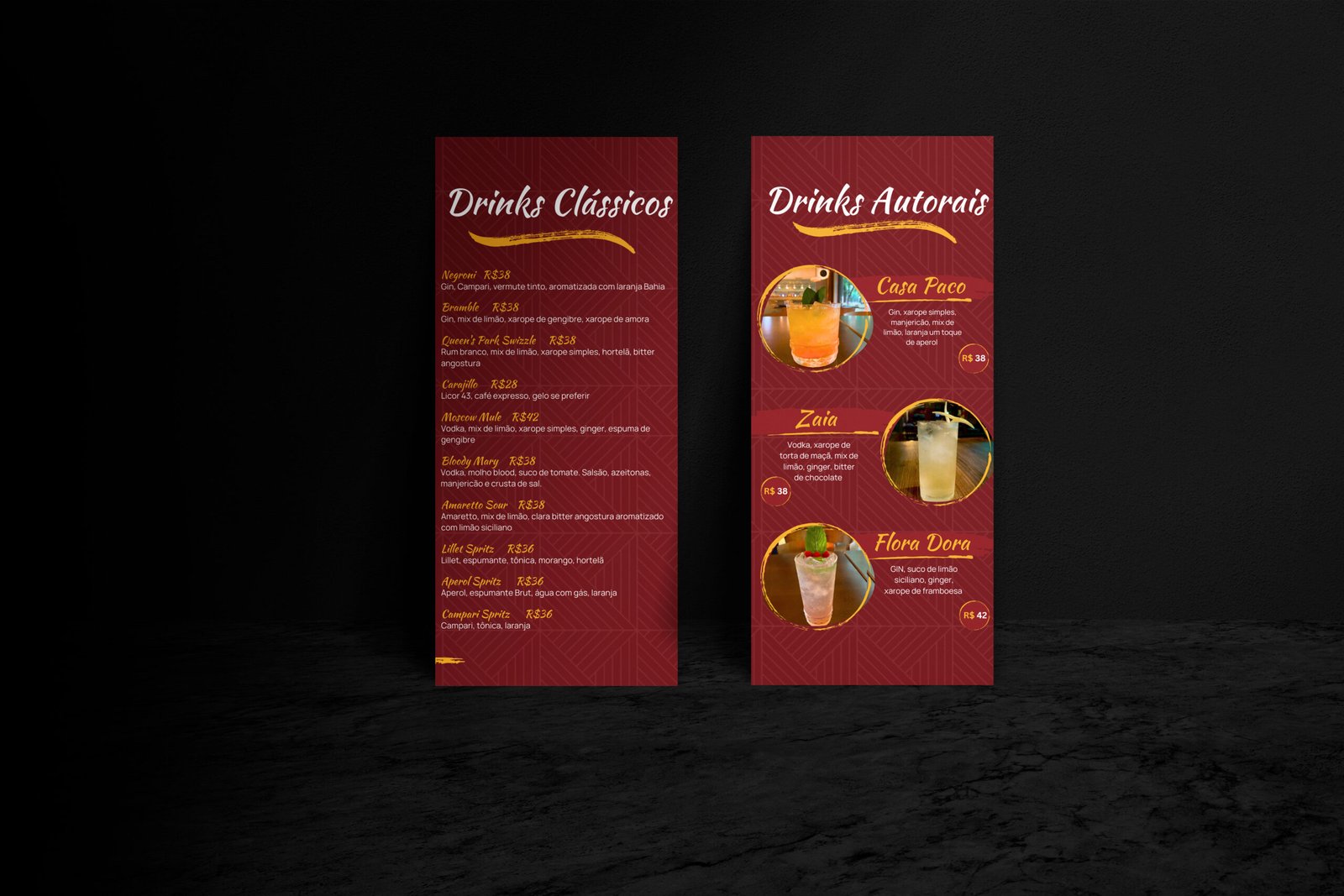
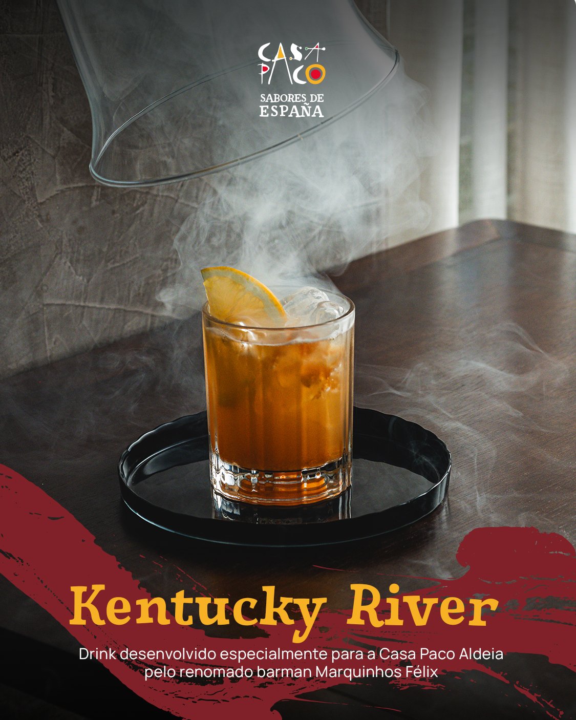
For the design, I opted for Siggy for headings, imparting an elegant touch, and used Manrope, a sans-serif font, for the body text, ensuring readability. To enhance visual appeal, the original red hue from the logo was deepened, creating a stark contrast with the vibrant yellow. This led to the development of two background options: a rich dark red and a sophisticated dark gray, amplifying the brand’s presence.
DELIVERABLES
Rebranding
Website Redesign
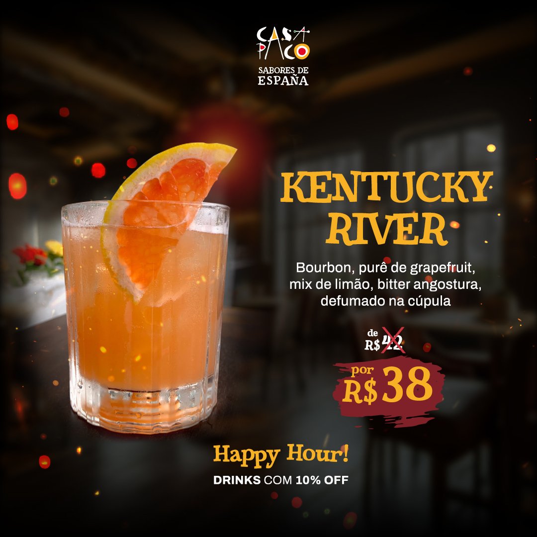
Social Media Templates
CATEGORIES
Graphic Design
Webdesign

Logo Redesign
